Tuesday 24 March 2015

HP SPECTRE x360 review

If you are looking for a truly impressive laptop with premium build quality, fantastic specs with solid performance, great battery life, and wrapped in an attractive thin-and-light package, then you’ve probably been shopping for a MacBook. HP is hoping to change all that with the introduction of the HP Spectre x360 (starting at $899.99).
This 13-inch ultrathin laptop not only delivers premium performance with premium hardware wrapped in premium materials, but the Spectre x360 also surpasses the 13-inch MacBook Air in terms of battery life, Wi-Fi performance, and the ability to function as a tablet. Before we explain why we think this is the most impressive HP consumer laptop we’ve ever seen, let’s address the elephant in the room and provide some background on the old “Windows vs Mac” debate.
While the overwhelming majority of businesses worldwide purchase Windows PCs to get serious work done, Apple’s MacBook line of notebooks are one of the most desired purchase options for U.S. consumers who want a “premium” computing experience.
Sure, Macs owners only make up 13 percent of the U.S. PC market, but that 13 percent of customers are willing to pay much more for each computer they buy. Every Windows PC manufacturer recognizes the monetary value of customers who not only see a product as “desirable” but who are willing to pay a “premium” price to own that product.
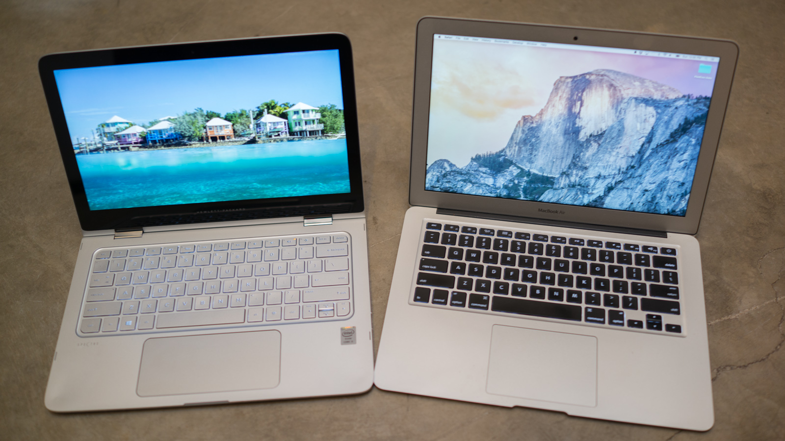
HP Spectre x360 (left) next to 13-inch Apple MacBook Air (right)
We’ve seen countless Windows laptops from a wide variety of manufacturers over the years that were designed to look “similar” to a MacBook and built “almost” as well as a MacBook for “around” the same price as a MacBook. None of the previous Windows-based MacBook clones competitors have dethroned Apple, and those Windows-based products usually failed due to at least one of the following issues:
  • MacBooks have arguably superior build quality with metal construction, lighter weight, and a simple, attractive design.
  • MacBooks include unique design features that improve the overall user experience (e.g., large gesture-enabled touchpad, high-resolution display, super-fast ports for transferring data, and MagSafe AC adapters).
  • MacBooks deliver a better user experience because Apple built the OS and the computer (resulting in optimized hardware and drivers for faster startup, better battery life, and fewer problems related to miscommunications between software and hardware).
  • When those consumers shopping for a premium PC saw a MacBook and a Windows laptop that was “almost” as good as a MacBook for around the same price, consumers usually said, “I’ll just buy the Mac.”
Which brings us back to the HP Spectre x360. Keep reading to see why we think Apple should be worried.
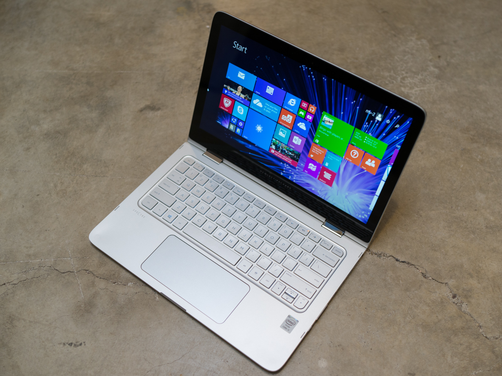
HP Spectre x360 in laptop mode

Build and Design

As the lengthy introduction suggests, the HP Spectre x360 is clearly targeting current and potential MacBook Air customers. This HP laptop isn’t a “clone” because it features multiple unique design elements along with durable multimode hinges that allow the Spectre x360 to function as a traditional laptop, a tablet, and move into two more positions for presentations. That said, you cannot help but notice several design similarities when you look at this HP next to a 13-inch MacBook Air.
The HP Spectre x360 features an all CNC aluminum chassis (each part of the chassis is milled from a single block of aluminum) and weighs just 3.3 pounds with a maximum thickness of 15.9 millimeters (0.625 inch). One design element that we really appreciate is that HP polished the metal on the sides of the chassis; this not only gives the edges a jewelry-like finish but it makes the edges of the Spectre x360 feel pleasingly smooth to touch when you plug in a USB drive or if you’re holding the x360 like a tablet for several hours.
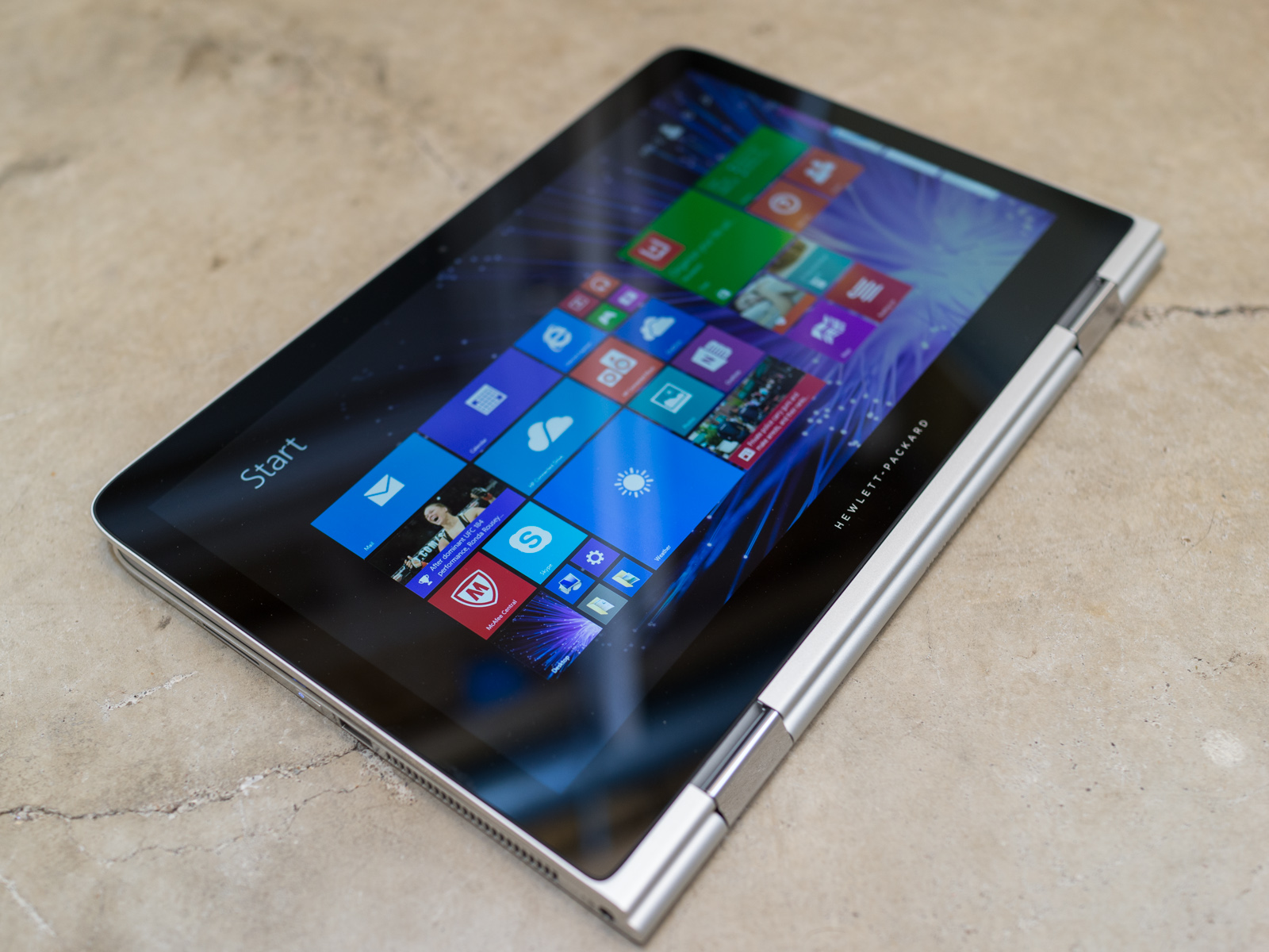
The HP Spectre x360 in tablet mode.
Opening the screen lid on the x360 and moving it into the variety of multimode positions is a likewise enjoyable experience thanks to the innovative new hinge design that HP is using here. Each hinge contains a set of three spiral gears that force the two hinges to move in precise synchronicity. In other words, if you grab one corner of the screen and move it the other corner of the screen will move smoothly and precisely so there is no “flex” in the screen as you move it from one position to another.
The geared hinges supply a nearly perfect balance of resistance and freedom of movement; the screen won’t move out of position simply because you press the touchscreen, but you won’t need to apply noticeably strong force to open the lid or move the screen into tablet mode. Additionally, the unique hinge design allows the x360 to maintain the exact same height/thinness in tablet mode that it has when the lid is closed (most “flip-screen” convertible laptops are slightly thicker in tablet mode because of the way the hinges move).
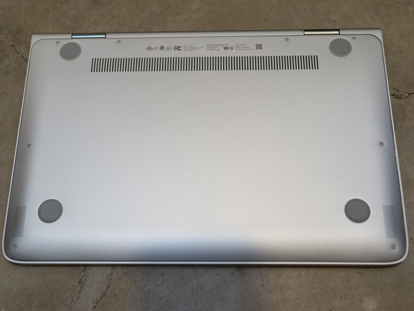
The bottom plate of the HP Spectre x360 is clean and simple.
The bottom of the Spectre x360 features a large base plate that is secured by eight T5 Torx screws. While this isn’t ideal for those who want easy access the internal components for service or upgrades, you can open the chassis.
On the other hand, the x360 suffers from the laws of physics just like a MacBook Air or any ultrathin laptop; in order to make a notebook this thin the manufacturer cannot use standard SATA connectors for hard drives (SATA is too thick). Thankfully, most consumers won’t want or need to upgrade the x360 since HP uses quality LPDDR3 RAM and impressively fast M.2 solid state drives (SSDs). We’ll talk more about the internal hardware in the performance section.

Ports and Features (and a freaking awesome Wi-Fi antenna)

The x360 might be as thin as a 13-inch MacBook Air but it’s packed with a noticeably superior variety of ports. The left side Spectre x360 includes the AC adapter connection, the cooling fan exhaust vent, a USB 3.0 port, the power button, and a SDHC/SDXC card slot. The right side ports include a second Windows button (for use when the x360 is in tablet mode), a rocker-style volume button, mini DisplayPort, full-size HDMI out, two additional USB 3.0 ports and a headset audio jack.
Spectre x360 left portsSpectre x360 right ports

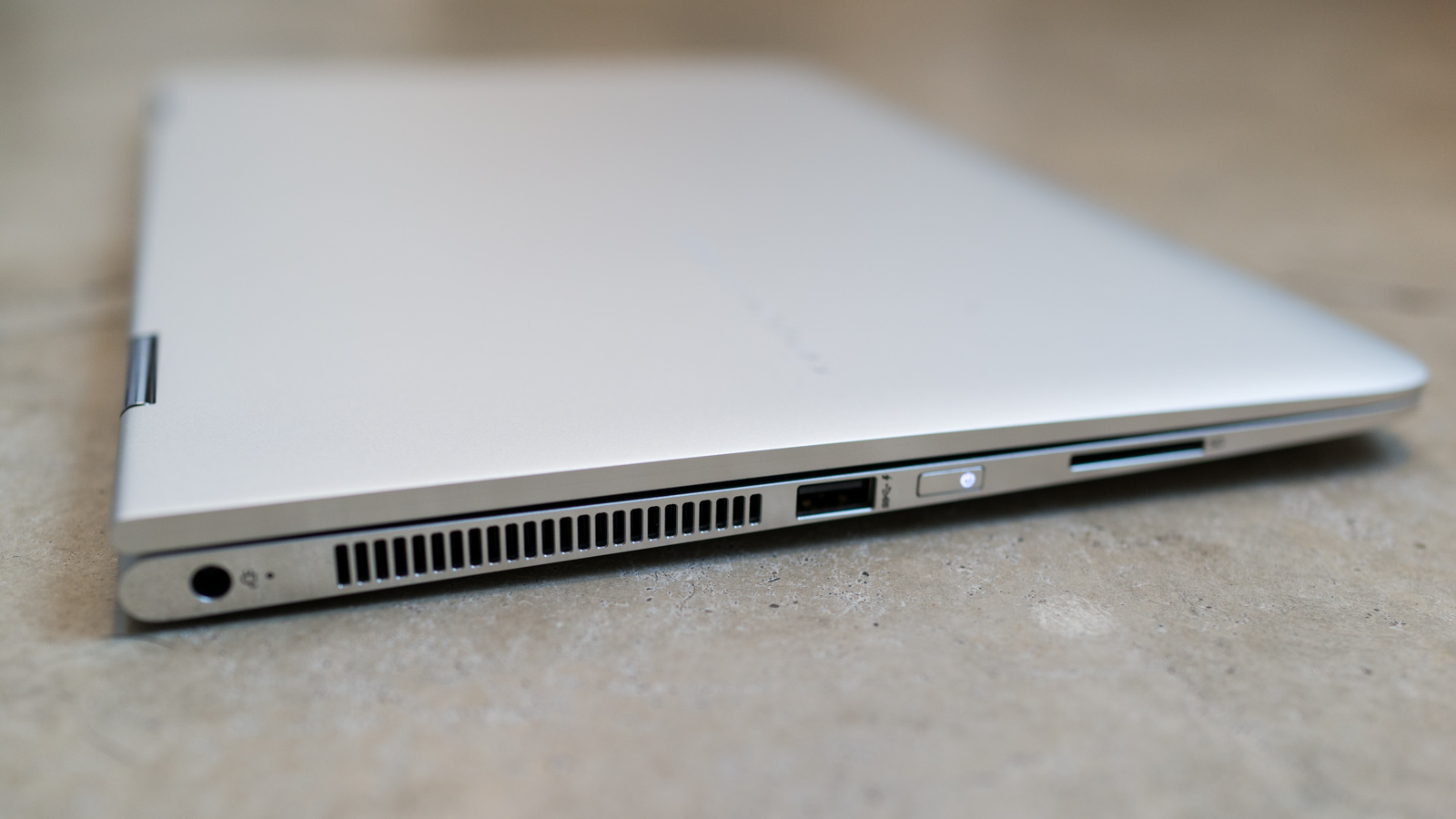
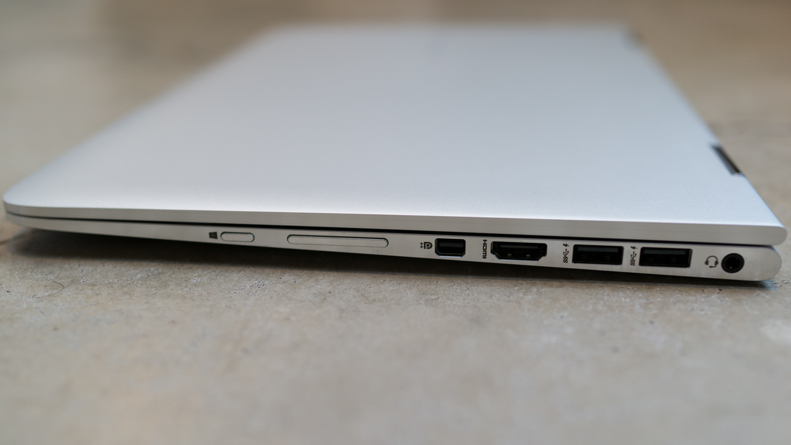
We should also point out that all three of the USB 3.0 ports on the Spectre x360 are “sleep and charge” USB ports … so you can charge USB devices even when the notebook is in sleep mode.
One feature that really surprised us was the Wi-Fi performance of the Spectre x360. HP has dramatically improved the Wi-Fi performance in terms of both speed and connection reliability thanks in large part to a new “antenna slot” that is milled out of the front/top edge of the screen lid. The antenna slot prevents the aluminum chassis from blocking the Wi-Fi spectrum and allows for more effective reception of both the 2.4 GHz and 5 GHz bands of the various 802.11 protocols.
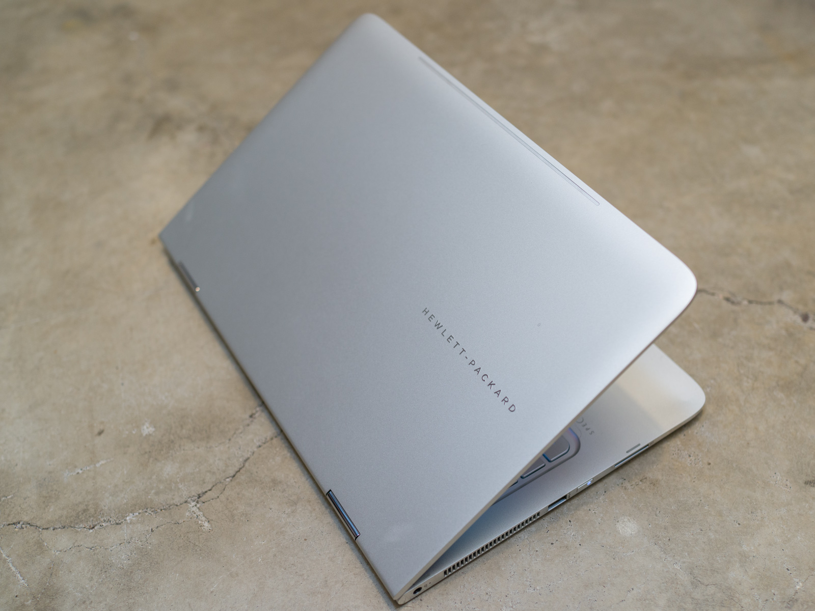
You may not notice the antennae strip on the top edge of the HP Spectre x360 screen lid.
Setting aside the techno-babble, the bottom line is the x360 delivers spectacular Wi-Fi performance. Not only did the x360 provide a stable connection to our test routers with impressive upload/download speeds at a variety of distances, but the x360 even managed to detect several distant routers located in nearby buildings that other laptops (including a 13-inch MacBook Air from 2014) couldn’t see on their lists of available Wi-Fi signals.
We compared the x360 against the 13-inch MacBook Air at the same location in our Wi-Fi test environment. The x360 managed a fairly consistent download speed that peaked at 53.0 Mbps and a reasonably stable upload speed that peaked at 5.8 Mbps with a ping response of 21 ms. The MacBook Air’s download speed was less consistent and peaked at just 42.8 Mbps but delivered similar upload and ping speeds.

Screen and Speakers

The high-resolution touch display on the Spectre x360 is another jewel in this attractive laptop. The touch panel surface is optically bonded to the display so less light from the LED backlight is diffused/lost, making the display brighter and making the screen easier to see at lower brightness levels (and helping to extend battery life).
HP offers two different IPS display options for the x360; either a Full HD (1920 x 1080 resolution) IPS touch-enabled display with 72% Adobe RGB color gamut or a Quad HD (2560 x 1440 resolution) IPS touch-enabled display for those who demand more screen real estate.
Spectre x360 screen frontSpectre x360 screen side
Spectre x360 screen forwardSpectre x360 screen back
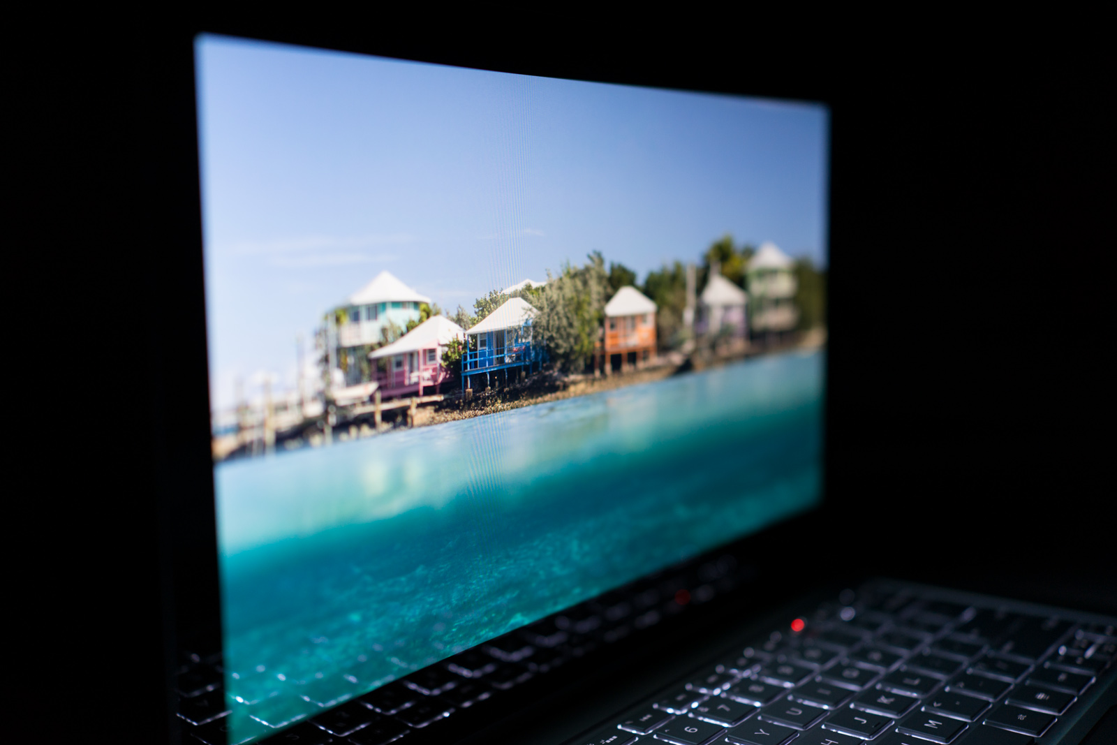
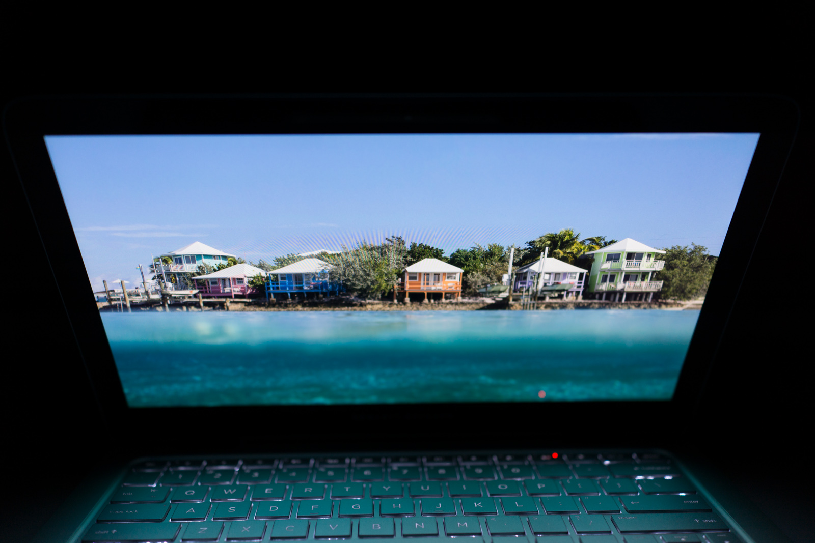
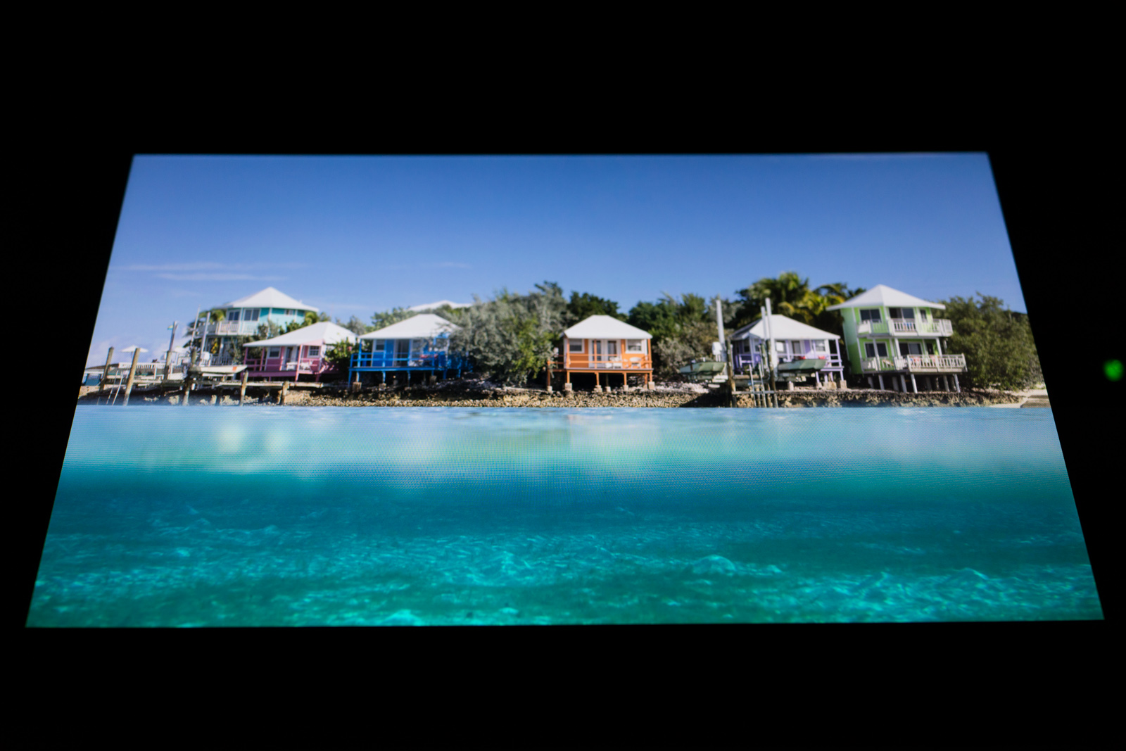
Our review unit comes with the FHD screen which delivers exceptional color accuracy, great contrast, and fantastic viewing angles combined with bright and evenly distributed backlighting. In short, this is the type of IPS touch display you want on a notebook. While we might have enjoyed playing with the Quad HD display, the reality is that the FHD screen is gorgeous and 1080p resolution is more than enough for most people using a 13-inch touchscreen (small icons on a Quad HD display will prove more difficult to reliably touch due to all those extra pixels being crammed into a 13-inch surface area).
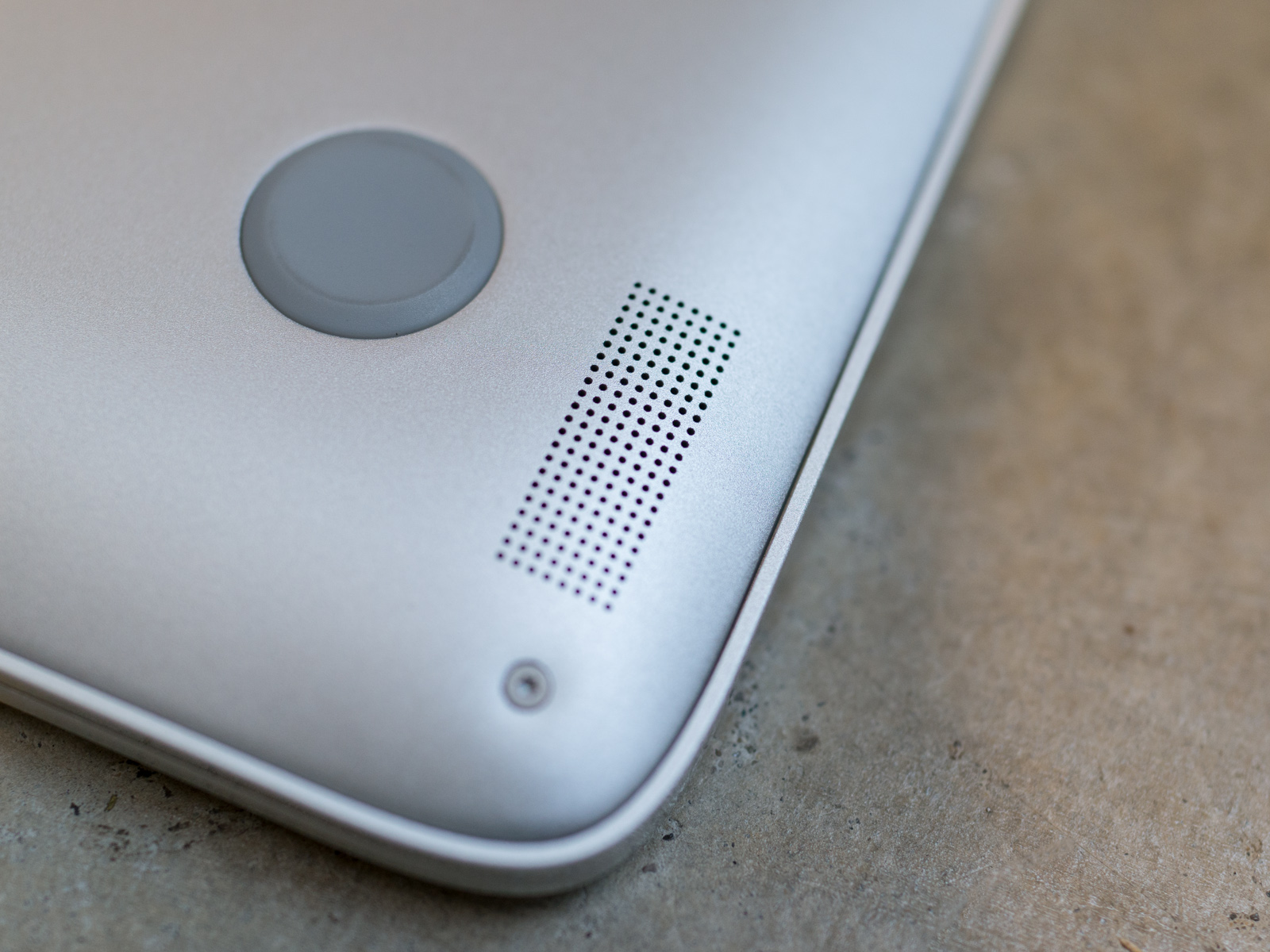
Two small speakers still produce big sound.
The small stereo speakers located on the bottom of the x360 are easy to overlook since these are non-branded speakers instead of the BEATS-branded speakers on previous HP premium notebooks. Nevertheless, these pint-sized speakers deliver quality sound at all volume levels. The audio playback has a decent range from highs to lows with good clarity but these little speakers can’t deliver the kind of bass you only get from a dedicated subwoofer.

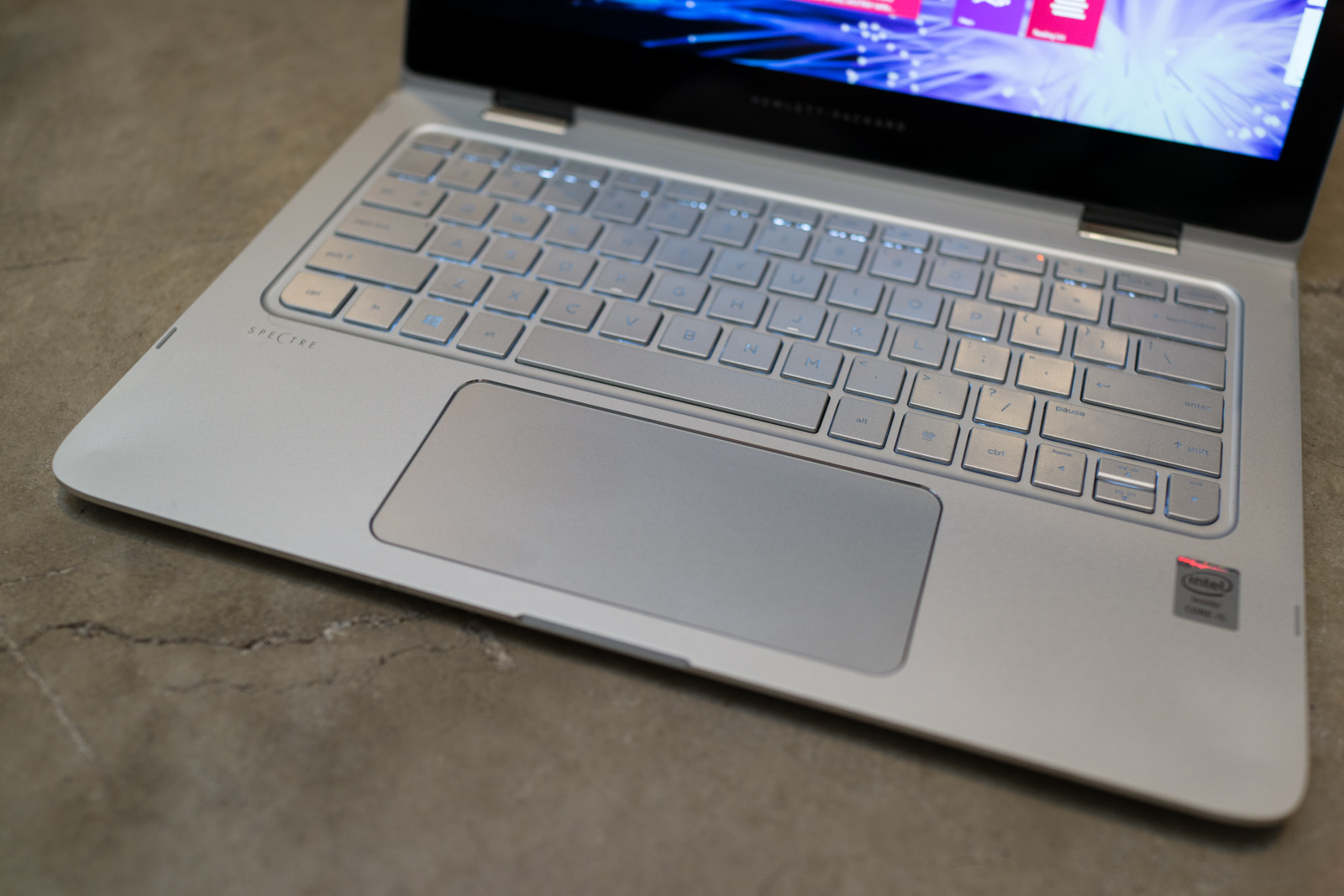
Keyboard and Touchpad

The full-sized keyboard on the x360 features Chiclet-style or island-style keys with LED backlighting. Unlike some 13-inch (and smaller) laptops, there is adequate spacing between each key to avoid the typos common to more cramped keyboards. HP was clearly focused on delivering a great typing experience with this laptop; each key has 1.5 millimeters of travel with good resistance and the perfect amount of feedback as you type.
Spectre x360 keyboard brightSpectre x360 keyboard night
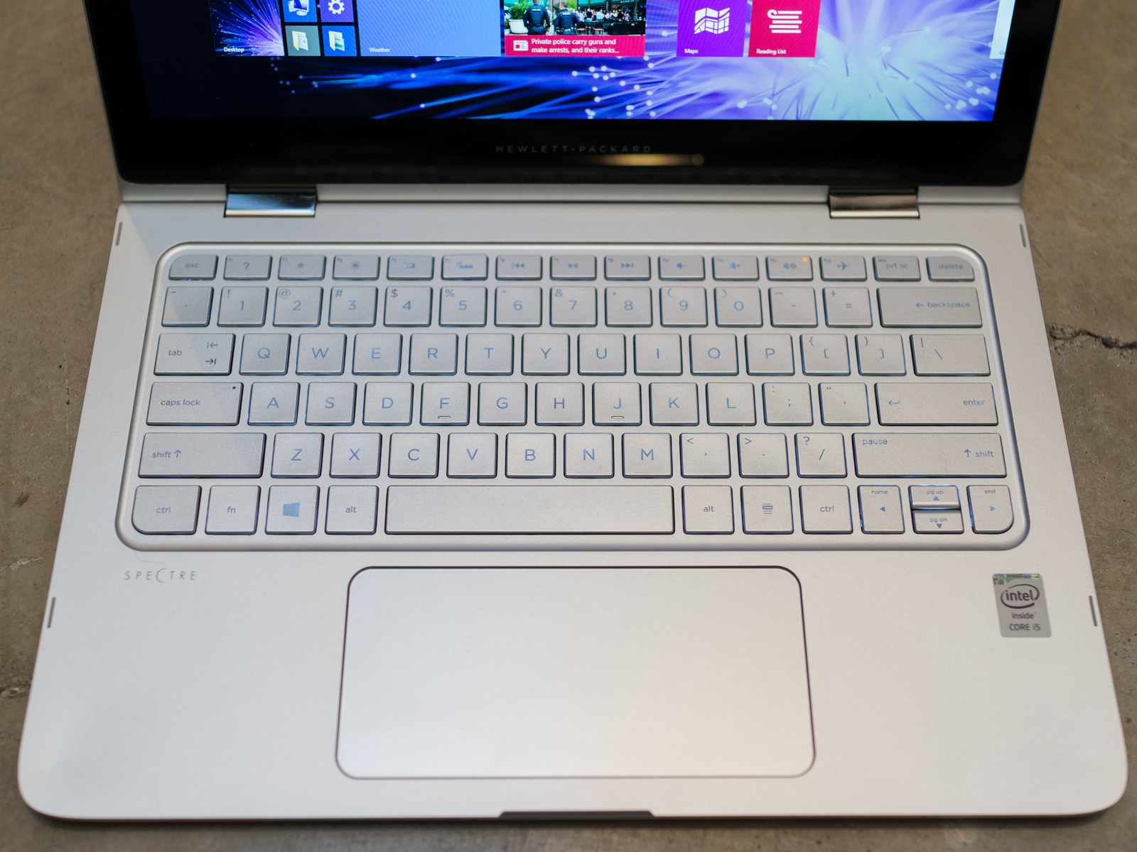
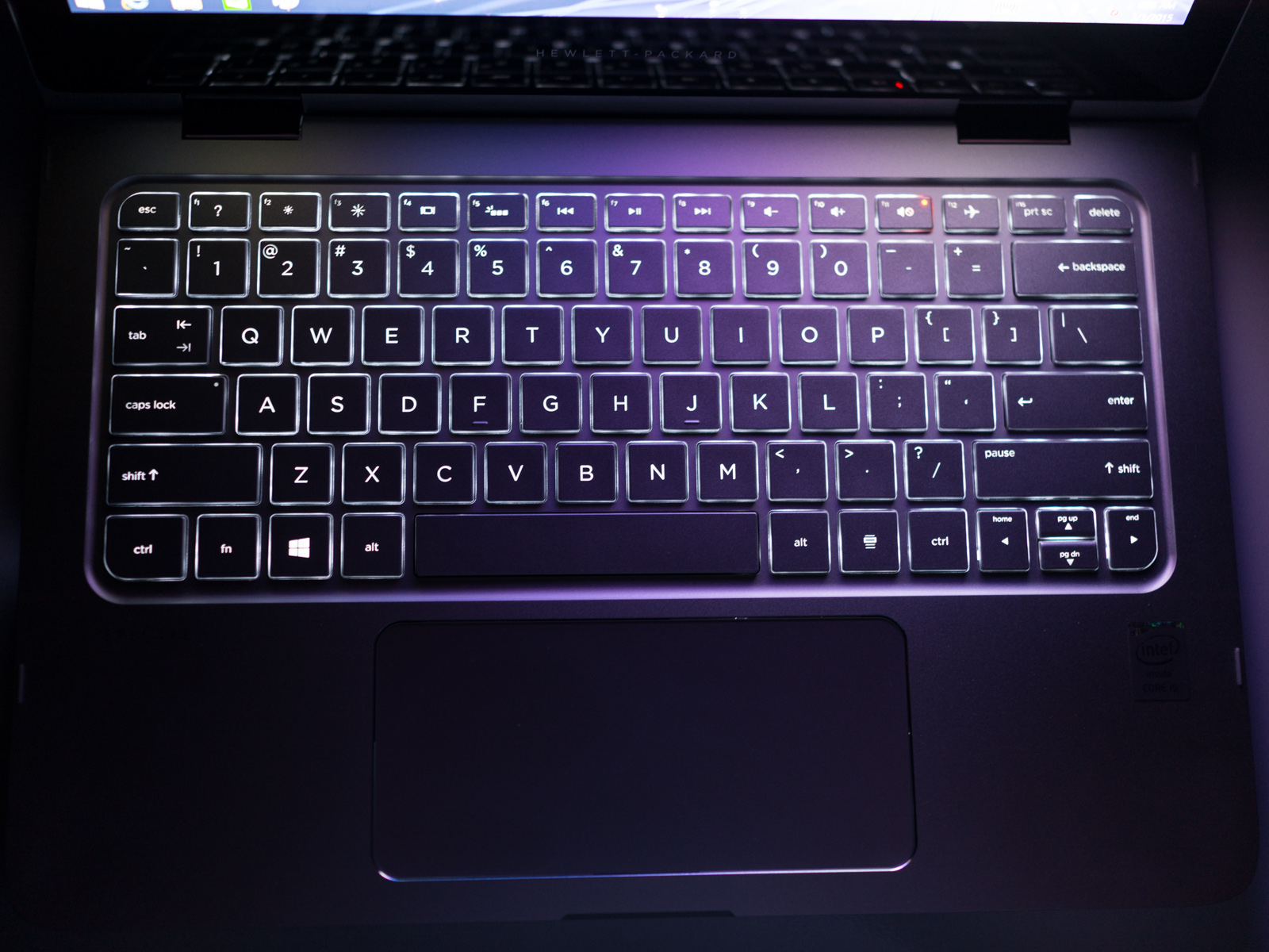
Our only complaint about the keyboard on the x360 is relatively minor: There is no option to adjust the brightness of the LED backlighting. The shortcut key controlling the keyboard backlight simply switches the backlight on and off. While the backlight is adequately bright for typing in a dark environment, we would have liked to make the keyboard slightly dimmer or slightly brighter.
In general, we enjoyed using the massive, gesture-enabled Synaptics ClickPad on the x360 because it provides ample space and features excellent palm rejection so the cursor doesn’t randomly move around the screen every time your wrist or palm brushes up against the touchpad as you type. The fundamental problem we have with the buttonless ClickPad on the x360 is the same problem that plagues every Windows laptop that tries to use a buttonless touchpad surface: Windows requires at least a left click and a right click for mouse operations.
Spectre x360 ClickPadThe reason that the buttonless touchpad works so well on Apple MacBooks is that the Mac OS was designed for a one-button mouse (yes, you can use multiple mouse buttons on a Mac, but the point is the default mouse setup is a single mouse button). A MacBook touchpad doesn’t need to worry about where a click happens because a click is a click, period. Windows requires at least a two-button mouse for left-click and right-click operations … and this is why buttonless touchpads have problems.
During our testing period we frequently pressed the glass ClickPad surface for a left click and the x360 would register a right click. Similarly, sometimes we would try to make a right click and the x360 thought it was a left click. Worse still, occasionally the ClickPad would simply ignore the fact that we made a click if it couldn’t determine whether the click was a left click or a right click. We managed to “partially” remedy the problem by adjusting the default Synaptic driver settings so the ClickPad did a better job of recognizing left clicks and right clicks, but we never completely eliminated the problem.
Bottom line, unless Microsoft switches to a single mouse button control interface in Windows 10, every notebook with a buttonless ClickPad will struggle with these issues to some extent.

Samsung S6 hands on preview

A radical redesign” is the best way to describe the newly announced Samsung Galaxy S6, not just in comparison to last year’s underwhelming flagship, but to the entire Galaxy series as a whole. It’s a radically different device from the ones that made Samsung a giant of the smartphone world, but the good news is that most of its changes are for the better.
Samsung Galaxy S6
Samsung Galaxy S6
Finally, Samsung has a flagship phone that genuinely feels high-end in your hands, one that actually comes off as worthy of its price tag. Although it still features many of the familiar Galaxy design cues, the S6 marks a major leap for Samsung thanks to its entirely plastic-free body. There’s no glossy polycarbonate or fake leather to drag things down this time, only two sheets of Gorilla Glass 4 on the front and back, and smooth metal around the sides.
At its premier at Mobile World Congress, Samsung revealed other significant novelties for the new handset as well, including a Material design-like makeover for the TouchWiz UI skin, a QHD (2560 x 1440) display that brings an astonishing pixel density of 577 ppi on a 5.1-inch screen, and a lightning-fast chipset, based on Samsung’s own eight-core Exynos 7420. Based on our limited time with it, the S6 feels like the first Galaxy phone in some time that’s wants to emphasize the premium over the practical.
Samsung Galaxy S6
Samsung Galaxy S6 back
That sentiment applies to the phone’s display, for one. Outside of its ludicrously high pixel density, the Super AMOLED screen brings the kind of lush colors and deep blacks that we’ve come to expect from Galaxy panels. The pixel boost admittedly doesn’t add much to the naked eye, but hopefully putting a QHD screen on this device will lead Samsung to use 1080p panels on its future mid-range phones. This isn’t a massive upgrade over the Galaxy S5, but then again that display didn’t leave much room for corrections in the first place.
Likewise, Samsung’s decision to forgo Qualcomm’s Snapdragon chips in favor of its own Exynos chipset doesn’t reveal anything that dramatically changes the user experience at first blush. It performs superbly in benchmark testing, and it certainly blazed in our time with it, but we’re still at a point where any performance differences between top-level chips are going to be negligible to non-hardcore users.
Samsung Galaxy S6
Samsung Galaxy S6 bottom
However, one benefit may be in the Exynos’ 14-nm architecture, which Samsung claims will help the S6 be more merciful towards its battery. This is why the company feels confident enough to put a relatively average 2500 mAh pack inside a phone with a QHD resolution. That’ll make battery life an area to monitor here either way, but it also allows the phone to stay good and thin at just 6.8mm thick.
It all comes back to the new build, though. It’s not a stretch to say that this is the best phone Samsung’s ever created when held in the hand. (At a time where simple spec boosts aren’t enough to carry a new flagship, the plastic of previous Galaxy phones may end up being a blessing in disguise.) After several iterations, it’s the first Galaxy phone to have that elusive “wow” factor. Of course, that’s less true when the S6 is put up against its Galaxy S6 Edge companion, which is more immediately striking across the board.
Samsung Galaxy S6
Samsung Galaxy S6
To be blunt, it’s impossible to not notice the design similarities between this and the iPhone 6, but those aren’t totally bad things. Most of the parallels come down to the button arrangement: The power key is on the right edge, at thumb height, while the volume rocker is on the left side, the USB hub is at the center of the bottom, and the 3.5-mm audio jack is just to its left. The speaker grille is startlingly similar to that of Apple’s device too, but we wouldn’t consider that the end of the world.
Less forgivable is the fact that this is the first Galaxy S phone in years to omit an exchangeable battery or a microSD card slot. The 32 GB of minimum storage space here is fine enough, but the aforementioned battery concerns only become amplified when the pack can’t be removed. Still, it’s hard to really hold this against Samsung – Apple’s designs have proven successful for a reason, and the sacrifices here might be worth it if it enabled Samsung to craft such improved hardware.
The perception of “copying” the iPhone and the removal of certain practical features will undoubtedly anger some Galaxy loyalists, but the fact remains that Samsung has largely addressed one of its largest mobile bugbears with the Galaxy S6. It’s a promising step forward for the Galaxy line and — with HTC sticking to minor updates for its latest flagship — feels like the most exciting handset to come out of Barcelona this year.

INSTAGRAM Reveals layout..Its own photo collage


If you've ever seen a collage in your Instagram feed, it was likely created by one of several third-party apps -- Diptic and Framatic are a couple that spring to mind -- that let you arrange multiple photos in a variety of grids. Now Instagram will let you do that with its very own layout app appropriately called, well, Layout. Much like Hyperlapse, Layout exists as a standalone app separate from the core Instagram offering. It's iOS-only for now, though an Android version should be available in a few months.
Gallery | 7 Photos

Layout interface

Once you launch Layout, the app takes you straight to the camera roll. At this point, most of the other aforementioned apps would ask you to select a grid before choosing your photos, which the Instagram team thought didn't make much sense. Layout, instead, lets you choose the photos first -- you can opt for as many as nine different photos to put in your collage. Also, while other apps add borders around the images, Layout foregoes them for a more seamless look.
As you pick your images, different layouts will appear dynamically at the top of the screen, organizing the photos in a way that the app deems best. You can of course go ahead and swap them around if you don't like the options -- there's also a Replace button that'll let you easily supplant a photo with another. You're also able to resize, mirror and flip the images if you like.
Gallery | 16 Photos

Layout samples

As Instagram was developing this app, it found that most of the collages on its service were of people, usually of family and friends. So aside from creating collages from just your recent images, Layout also has a Faces tab that'll surface the photos in your camera roll that have faces in them -- it uses Apple's iOS SDK for face detection to do this. As you pick the different photos with faces, the app is then smart enough to center the face in the frame.
Last but not least, the Layout app comes with a Photo Booth feature that lets you take four selfies in quick succession. You could stay still the whole time, of course, but the idea is to move the phone around in between each shot in order to capture unique angles for the collage. Once you're satisfied with your collage creation and you hit Save, you'll then be prompted to either send it to Instagram, Facebook or another supported iOS app.
Keen to show off the creative potential of Layout, the Instagram team created a slew of collages using the app that demonstrate all the cool things you can do with it. You can check them out in the gallery above, and if you feel like creating your own, you can go ahead and download it starting today.

MOTO E REVIEW


If you want to get a sense of where the real innovation in smartphones is happening, you need to look past the high-end flagships and toward the cheap stuff. And with the new Moto E, Motorola has crafted one of the most compelling budget smartphones yet. Starting at just $150, it's a tad more expensive than last year's $120 model, but it makes up for that with upgrades that make it a far more usable phone. Those include the addition of LTE, 8GB of built-in storage (twice as much as its predecessor) and a slightly bigger screen. (Moto's also offering a $120 3G-only version.) It may not sound all that exciting if you're waiting for the new Galaxy S6 or HTC One, but it's a solid choice for someone who doesn't need a powerful phone. And it's yet another sign that even the geekiest among us may soon be springing for inexpensive, contract-free phones.
Gallery | 12 Photos

Moto E review (2015)

83
Motorola

Moto E (2015)

Pros
  • Inexpensive
  • Elegant and comfortable design
  • Great battery life
Cons
  • Generally slow performance, despite good hardware
  • Mediocre camera
  • Display is difficult to read outdoors
Summary Motorola's new Moto E is a solid improvement over its predecessor, with plenty of features for a low price. But it's also easy to see where Motorola had to sacrifice quality to make it inexpensive.

Hardware

The Moto E should feel familiar to anyone who's held a Motorola phone since the Moto X debuted in 2013. Even though the company's owner has since shifted from Google to Lenovo, Motorola is still sticking with the same curved-case design, which fits oh so nicely into your hand. Sure, it's still made out of plastic, but for this price I'm not expecting a metal unibody getup. What's truly impressive is that the Moto E doesn't feel like a toy, even though it's one of the most inexpensive smartphones you can buy right now. In 2014 we were amazed that a decently capable smartphone could be cheap. This year, the big takeaway is that it actually has some style to it.
The smooth edges from last year's model, which tended to make things a bit slippery, have been replaced by ridges that help quite a bit with grip. In general, the device has a nice, solid feel, largely thanks to the lack of a removable rear panel (read: there isn't much to flex). If you want to get to your SIM card or add more storage, you just have to snap off the phone's plastic perimeter (available in several colors).
Motorola's slight screen bump to 4.5 inches, up from 4.3, makes the Moto E feel even snugger in your hand. Even more importantly, the addition of LTE makes it just as capable as more expensive phones when it comes to downloading and streaming media. Unfortunately, its screen resolution is still stuck at a relatively paltry 960 x 540 (qHD). It's once again packing a 5-megapixel camera, but there's now a 0.3 megapixel (VGA!) front-facing shooter as well. That won't be much use for taking quality selfies, but at least you've got the option for video chat now.
While most of the Moto E's hardware makes a strong first impression, its display is where you begin to see the sacrifices Motorola made to reach such a low price. It's a decently bright, colorful IPS LCD screen that fares well indoors, but once you step outside it becomes a pain. The smallest amount of sunlight makes it hard to see anything on the screen. (The photo above was taken at its highest brightness on a partially cloudy day.) It's not impossible to use, but it's certainly not user-friendly. You can't blame Motorola too much, though: There simply aren't many inexpensive displays that can take on the sun well.
The other problem with the Moto E's screen is its relatively low 960 x 540 resolution, which ends up making text, photos and just about everything else a tad less sharp than on other smartphones. It's not a night-and-day difference from the 1080p displays we're used to today, but it's still a noticeable step down. I came to dread reading long articles on the phone during my subway commute, whereas that was usually the time where I put a dent in my Pocket queue. Maybe that was just an unconscious reaction to the lower specs, but it's still worth noting. If you're stepping down from a more capable display, you'll probably get used to the lower resolution, though. And it probably won't even register to people upgrading from other cheap handsets, or buying their first smartphone.

Software

No, the Moto E doesn't run stock Android 5.0.2 Lollipop -- but it's close. Sticking with a strategy it's used since the first Moto X, Motorola once again managed to deliver a phone that's mostly free of the crapware that plagues other devices. It packs in apps from Plex, Revision3 and Flixster, but those are things you may actually want to use, so I didn't find them bothersome.
The few custom Moto tweaks actually make it more appealing than a totally stock Android phone. There's Moto Display, which lights up notifications on the phone's screen when you pick it up or rock it on a flat surface. Surprisingly, Motorola even brought over the double-twist gesture, which quickly loads the camera when you flick your wrist twice while holding the phone. Just as with the Moto X, that gesture gets you to the camera at any point, including when it's still locked. Those sorts of innovations were one of the key selling points for the original Moto X, which makes it all the more impressive that they're here at all.

Camera

Just like its screen, the Moto E's so-so camera capabilities won't make you forget that you're using a cheap phone. Its 5-megapixel rear shooter performs fine in daylight and bright indoor scenes, but it's pretty much useless in low light. And no, there's no flash either, if you're into that sort of thing. In decent lighting, the Moto E's camera delivered usable shots, but they were all a bit soft and lacked fine detail. There's also quite a bit of color fringing when the sun creeps into your photos. It's a camera that'll be ideal for quickly throwing photos up on Facebook or Instagram, but it won't give you any high-quality keepsakes.
Gallery | 14 Photos

Moto E (2015) camera samples

I didn't spend too much time with last year's Moto E, but there seems to be a slight improvement in overall photo quality when compared to the test shots in our last review. And -- good news! -- you can finally record high-definition video. It's only 720p, but it's something.
Once again, Motorola's simplified camera software is the Moto E's saving grace. You can tap anywhere on the screen, or hit one of the volume buttons, to snap a shot. There's no need to aim for a virtual shutter button. Autofocus is just fine (it's sometimes snappier than more expensive smartphones I've tested), and the phone generally manages to take a photo in under a second. But of course, there's no fancy image stabilization here, so the quality of your photos will usually depend on how steady you can hold the Moto E. As for that wrist-flick camera gesture, I was honestly surprised at how well it worked. It typically launched the camera in just a few seconds -- yes, even when the phone was locked -- and it ended up being faster than my iPhone 6 on several occasions.

Performance and battery life


Moto E (2015) Moto E (2014) Moto G (2014) Moto X (2014)
Quadrant 2.0 12,352 5,264 8,846 22,721
Vellamo 3.0 1,929 1,173 1,669 2,093
SunSpider 1.0.2 (ms) 1,368 1,626 1,534 787
CF-Bench 17,483 6,483 14,470 39,018
SunSpider: Lower scores are better; results compiled on Chrome.
Acceptable. That's the best way to describe the Moto E's overall performance. Its 1.2GHz quad-core Snapdragon 410 processor is fine at accomplishing a single task, like navigating through YouTube and watching videos, scrolling through web pages or browsing through music on Spotify. But once you start asking the phone to do more than one thing at a time -- say, browsing Twitter while Google Play downloads and updates apps in the background -- it becomes an exercise in frustration. Everything takes way too long to load, and it almost feels like you're fighting through a veneer of molasses as you interact with the phone's touchscreen. That's especially surprising since it's packing a gig of RAM.
Even when you're not overloading the phone, the Moto E feels considerably slower than most other handsets. There's always a quarter-second delay when you're doing just about anything, be it tapping an app icon, hitting a link in Chrome or making fast gestures with your fingers. But again, this is a $150 phone! A certain amount of slowdown is acceptable for a phone in this price range. And, as with its camera deficiencies, the less discriminating smartphone shopper might not notice the issues.
What's most impressive about the Moto E? It's much faster than its predecessor, and in some benchmarks it even bests the new Moto G. That raises some questions, though: Why, exactly, does it feel slower than the revamped Moto G when it has more powerful hardware? My guess is that lower-quality components, like its touchscreen, end up negating the hardware bonuses. Swiping and scrolling on the Moto G's screen feels buttery smooth, whereas the Moto E's screen feels like you're swiping through butter.
After using the Moto E for several days, its speed issues bothered me less and less. In fact, it might be the ideal for anyone who feels overwhelmed by the onslaught of digital information we face every day. It forces you to be mindful and methodical about everything you're doing. This may just be the first phone that's best suited for the Zen state of mind. If you haven't mastered your inner calm yet, though, then you might be better off with the Moto G.
One benefit of being slightly underpowered? Great battery life. I was typically left with around 25 percent of battery after a full day of use. The Moto E also managed to last around 10.5 hours on our standard battery test, which involves looping a 720p video at half of the screen's brightness until it dies. That's a huge jump over the original Moto E, which hung in there for 5:45. It also lasted more than seven hours across a slew of other battery tests, which involved browsing websites, running a bit of 3D games and playing media. The Moto E's 2,390mAh cell is a solid improvement over the previous model's 1,980mAh capacity, but it's also helped by better energy management in Android Lollipop and the Snapdragon 410 processor. For someone who doesn't use their phone very often, it may end up lasting two days on a charge.

The competition

Cheapo Android smartphones aren't hard to find, but most of them aren't devices you'd actually want to use. Sharp's $149 AQUOS Crystal is a decent option, but you can only snag it on Sprint or Boost Mobile. There are also plenty of low-end Windows Phones, like the recently announced $70 Lumia 430 and the Lumia 640, but you'd have to forgo Android's richer app ecosystem to use one of those. The Moto E, as an inexpensive phone that proves itself capable with a solid selection of features, is a rare breed. It's a significant step up from last year's model, which didn't even have LTE.
The toughest decision with the new Moto E? At $150, it's only slightly less than the $180 Moto G, which has a 5-inch screen, a significantly better camera and a far more responsive interface. I bet the new Moto E's $120 3G variant will end up being far more popular than the LTE version I tested out.

Wrap-up

If your main concern when choosing a smartphone is price, and you don't want to be locked into a lengthy carrier contract, the Moto E is a good choice. Motorola's done a fine job of bringing its curvy design and technology down to a low price point (though it'll be even more appealing when the LTE version gets a price drop). Even if it's not quite your bag, you can't deny what Motorola has done. Companies like OnePlus and Xiaomi are getting plenty of credit for making cheap phones with high-end hardware, but even those phones would be overkill for less demanding users. Motorola, on the other hand, has taken that idea even further by making the lowest of the low end something you'd actually want to buy.